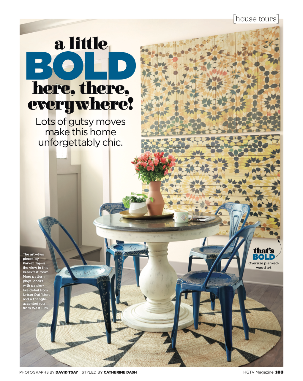
Pretty cool, right? We were beyond thrilled to have our home featured by HGTV. They are major champions of bold pattern and color, so it was a huge honor to see ourselves in their magazine. Here are all the fabulous shots from the article, plus my design notes.


The Breakfast Nook
Our breakfast nook is one of my favorite spots in the entire house. It reminds me of past travels in France and Morocco and feels like a pretty little street café. The dining table came first, a classic style crafted from reclaimed wood with a glossy stone top. For a fun contrast, I then chose metal chairs in a bright blue, with hand-painted henna designs all over the frames. Having a 10-foot white wall as the backdrop, one piece of statement wall art was not enough…so I hung two. It’s eye-catching color that you can see all the way from the front door when you enter the house.


The Kitchen
On the other side of the breakfast nook is our gray and white kitchen. The special parts of this space are in the finishes. We have an open floor plan, and it felt right to keep things a little more simple since all the areas surrounding the kitchen are heavily layered with mixed prints and all the colors. I chose dark gray cabinets, white arabesque tile, reclaimed corbels, and vintage style lighting to keep the French Moroccan vibe going. The quartz countertops are a mom-life must, and worth every penny for the amount of crafting and spilling that happens on the island. Everything from red wine to red Sharpie has stained the surface, and wiped clean every time. To the left of the picture you can also get a peek at our bar/pantry area. Color comes back into play with bright blue cabinets and a darker dose of the same arabesque backsplash tile.

The Study

The Dining Room
Blue is definitely the unifying color throughout our home, and it really sings as soon as you walk through the front door. The study and dining room flank the entryway and mix up lots of different takes on my favorite indigo hues. The oversized chairs and dramatic drapes in both rooms are super dreamy.

The Play Room
Creating bright and playful spaces for little ones is my happy place. Kids are fearless when it comes to surrounding themselves with color and pattern. They are my absolute favorite clients.


The Kids’ Rooms
I knew these areas would be updated as the kids got older, so removable wall decals were an easy way to add a whimsical element. I am so thankful that we were able to capture Mira & Zane in their first bedrooms…it’s already time for a redesign to match their current ages. (Stay tuned!! Mira’s tween room vibe is folkloric floral, and Zane wants to feel like he lives by the ocean.)

The Guest Room
Our guest room is another bright spot in the house. Blue is still key, but here it’s mixed with teal and bright pops coral. Between the grasscloth wallcovering, peacock headboard, and basket light fixture, we aimed for the textures in this room to make it feel like a charming little getaway for our visitors.


The Owner’s Suite
A calmer color palette makes this space feel like a retreat, but we chose a super dark navy paint to make the neutral furniture pop. All the patterns and textiles are a nod to our frequent travels and the entire suite is a balanced mashup of old world and wanderlust.


But, what about the art studio? Where are all the plants? And what’s in the family room? I’ll be posting pictures and design notes on the rest of the house soon. Get on the list so you don’t miss out on where I hung that last batch of indigo drapes and which bathrooms got wallpapered head to toe.
Read the full article on HGTV!
(Photo credit David Tsay, design Lisa Gabrielson and Sonal Patel-Cochran)

I LOVE this so much, Sonal! Your home is stunning!